Open a Grid component
- Javascript
- Ajax Windows
- Background Style Property
- Centering Content
- Target Grid Definition Properties
- Advanced Properties
- Target Window, DIV, Tabbed UI Pane or Panel Properties
- Window Buttons Properties
- Optional Window Parts Properties
- Window Animation Properties
- Client-side Events Properties
- Tab Pane Javascript Properties
- Ajax Failed/Offline Javascript Properties
- Videos
Description
Opens a grid component in a pop-up window, or in a DIV on the current page. This requires first defining a grid component.
Used with the Grid and UX component
Javascript
{grid.componentName}_X_ACTIONBUTTON_1(this);Ajax Windows
Pop-up Ajax windows can handle animation affects. However, Ajax windows that contain IFrames, which in turn contain display PDF files, cannot be animated. As a result, the Animation property has not been made available for Ajax windows that host .a5w pages, since .a5w pages are hosted in an IFrame. There are several animation methods that have been exposed. The 'slide' and 'fade' methods are based on methods in the jQuery core library. All of the other methods are based on method in the jQueryUI library. By default, both of these libraries are loaded. The Web Project Properties dialog contains settings which control if these libraries are loaded, and from where they should be loaded. You can control the animation effect for the window display and the window close. You can also control the animation speed. If you use the smart field to choose an animation, the animation builder will pop up.
Certain animation styles will mess up the positioning of windows. If you find this to be the case, you should stick with the 'Fade' style for the 'show' animation.
Background Style Property
You can set a background style property for pop-up Ajax windows. This will allow you, for example, to set a background color, or background image for the window.
Centering Content
Ajax Windows that display Grids, Dialogs, or Custom Components can automatically center the content in the window. You can specify if you want vertical, horizontal or both vertical and horizontal centering. The image below shows a pop-up Ajax window where a background color has been set, and the window contents has been centered on both the vertical and horizontal dimension.
Create a Window linked to a button
add a button to fields list
make an onClick Event for it
Add Action - Ajax Pop-up window
Centering a Window - one of the options in the Ajax pop-up definition
Target Grid Definition Properties
- Grid name
Grid name property.
- Grid alias
Grid alias property.
- Base Filter
Specify the base filter. The Base filter cannot be removed by the user. The Grid is filtered on both the Base filter and the User filter.
- User Filter
Specify the user filter. The User filter can be removed if the user executes a 'Show All' command. The Grid is filtered on both the Base filter and the User filter.
- Link
Link property.
- Order
Order property.
- Argument bindings
Specify where the arguments get their values from.
- Override settings
Specify if you want to override in properties in the target component. In V11 and above, you can also set session variables when the target component is opened.
- Use master style
Use master style property.
- Use cached grid
(Applies only when target Grid is opened in a window) When the target Grid is opened a second and subsequent time, a cached version is used to speed up the display. In some situations you might not want to use the cached version.
Advanced Properties
- Debug mode
Save debugging information for submission to Alpha Software.
- Timer
Show timing information for the Grid execution.
- Show query syntax
Show syntax for queries.
Target Window, DIV, Tabbed UI Pane or Panel Properties
- Target
Specify if the page should be opened in a pop-up window, a DIV on the page, a Panel or (if the component is running in a Tabbed UI) in a new Tabbed UI pane. (If you choose the 'Tabbed UI Pane' option, and the component is not running inside a Tabbed UI, it will be opened in a modeless pop-up window). Choices include.
- Parent Panel Navigator
Specify the Id of the parent Panel Navigator. The dynamic Panel will be added to this Panel Navigator.
- Dynamic Panel Title
Specify the title for the Dynamic Panel.
- User can close dynamic panel
(Only applies if the target Panel Navigator has been configured to use a Tab Band) Specify if the label for the dynamically added Panel has a 'close' icon that allows the user to close the dynamically added Panel.
- Working message placement
Specify the panel where the wait message should be shown. You should chose a Panel that is currently visible, not a Panel that will be animated into view when the component is rendered.
- Working message uses CSS3 animation?
Specify if the working message should be displayed using a CSS3 animation?
- Working message animation size
Specify the size of the animation in pixels.
- Target Panel
Specify the Panel Id.
- Target DIV ID
Specify the ID of the target DIV. This DIV can be in the Grid component (for example, in a free-form edit region), or on the .a5w page that contains the Grid component. TIP: If you want to specify a DIV that is inside a freeform edit region in a Grid cell, use the '{grid.rowID}' placeholder in the DIV id. For example: 'div1_Row{grid.rowID}'. This will ensure that each row has a uniquely named DIV in which the target page can be displayed.
- Target DIV style
Specify the in-line style for the target DIV.
- Can hide target DIV?
Specify the DIV can be hidden (to remove from view the target page after it has been opened in the DIV).
- DIV hide hyperlink
Specify text for the hyperlink that hides the DIV where the target Grid is shown.
- Window type
Specify the window type. Popup windows will show in a moveable window on the page. Dropdown windows have no title bar and cannot be moved. By default, Dropdown windows open directly below the control that you click to open the window. Note: An Ajax window will NOT be blocked by a browser's internal protection against popup windows.
- Lock overlay CSS class name
Specify the CSS class name to use for the overlay that is displayed behind the window. The overlay prevents the user from clicking on controls that are outside the window. Leave blank, or specify <Default> to use the default style. Specify <Invisible> to create an invisible overlay (has no color, but user is still prevented from clicking on controls off the window). By specifying a class that has a 'background' attribute, you can control the color of the overlay. For example: background: rgba(0,0,0,0) to create a transparent overlay.
- Sub-theme
(Optional) Specify a sub-theme for the window. The sub-theme can select a different pre-defined window 'look'. If you leave this property blank the 'base' sub-theme is automatically selected.
- Window name
Set to <Default> to give the window a default name. If you give the window an explicit name (which must be unique), then you can easily get a pointer to the window to execute methods of the window object. Click the smart field for tips on how to name your window and for information on how to get a pointer to the window object.
- Dock window
Docked windows 'stick' to an edge of the screen and remain in place even when the page is scrolled.
- Dock location
Specify which edge of the screen the window is docked to. Choices include Left, Right, Top, Bottom.
- Allow auto-close of dirty Grid
Specify if the window should close automatically when the user clicks off the window when the Grid is dirty. When a window is set to use the 'Dropdown' style, clicking anywhere on the page outside the window will normally cause the Window to close. However, if the Grid that is shown in the Window is dirty, the window does not close, unless this property is checked.
- Window position
Specify where the window will be shown.
- Dropdown Window position
Specify where the window will be shown.
- Re-use existing window
Specify if multiple modeless windows can be opened, or only a single modeless window.
- Window title
Specify the window title. The window title can contain data from fields in the current record. Enclose field values in curly parens. e.g. Customer - {lastname}. To reference values from a column in a List control use this syntax: {LIST::ListName::ColumnName} (e.g. {LIST::MYLIST1::LASTNAME} )
- Window title show
Specify if the window title should be shown or hidden.
- Window title position
Specify if the window title should appear at the top or bottom of the window. Choices include Top, Bottom.
- Window title direction
Specify if the direction is 'ltr' (left-to-right) (title on left, close button on right) or 'rtl' (right-to-left) (close button on left and title on right). Choices include ltr, rtl.
- Window title has close button
Specify if the window title has a Close button.
- Disable window move
Specify if the window cannot be moved by the user.
- Pane title
Specify the tab pane title. The pane title can contain data from fields in the current record. Enclose field values in curly parens. e.g. Customer - {lastname}. To reference values from a column in a List control use this syntax: {LIST::ListName::ColumnName} (e.g. {LIST::MYLIST1::LASTNAME} )
- Auto refresh on focus
Specify if the content in the tab pane should be refreshed automatically every time the pane gets focus.
- Window height
Specify the window height. Use CSS syntax. For example: 3in, 10cm, 200px. If you do not set the height, the window will resize automatically to accommodate the window contents.
- Window width
Specify the window height. Use CSS syntax. For example: 3in, 10cm, 200px. If you do not set the width, the window will resize automatically to accommodate the window contents.
- Window is resizable
Specify if the window is resizable.
- Working message
Specify the text of the message to show in the window while the window waits for its contents to be generated.
- Working message icon
Specify the image to show in the window while the window waits for its contents to be generated.
- Refresh Grid on window close
When the window is closed, specify if the Grid should be refreshed. You can refresh the current row, or all rows in the Grid. Choices include.
- Refresh Parent Tab Pane on Tab Pane close
When the Tab Pane is closed, specify if the parent Grid should be refreshed.
- Window background style
Specify the inline-style for the window background
- Center window contents - vertically
Specify if the window contents should be vertically centered
- Center window contents - horizontally
Specify if the window contents should be horizontally centered
- Warn before closing if Grid in window is dirty
If the Grid shown in the window is dirty, should a warning be displayed when the user tries to close the window?
- Has pointer icon
Specify if the window has a pointer icon that points to the element that was clicked to show the window.
- Pointer position
Specify the window edge that has the pointer icon. If you select 'Auto' the most appropriate edge is automatically selected. Choices include Auto, Top, Bottom, Left, Right.
Window Buttons Properties
- Has custom toolbar buttons
Specify if the window has custom buttons in the window toolbar (at the bottom of the window).
- Define buttons
Define the buttons that appear in the window toolbar (at the bottom of the window).
- Buttons in-line style
In-line style for the buttons. TIP: To display the buttons left justified, enter an in-line style of: text-align:left;
Optional Window Parts Properties
- Show top bar
Specify if a top bar should be shown. (Shows above the window body, but inside the body container).
- Top bar HTML
Specify the HTML to show in the top bar.
- Top bar style
Specify the in-line style for the top bar.
- Show bottom bar
Specify if a top bar should be shown. (Shows below the body, inside the body container).
- Bottom bar HTML
Specify the HTML to show in the top bar.
- Bottom bar style
Specify the in-line style for the top bar.
- Show header
Specify if a header should be shown. (Shows above the window body, but inside the body container).
- Header HTML
Specify the HTML to show in the header.
- Header style
Specify the in-line style for the top bar.
- Show footer
Specify if a footer should be shown. (Displays below the body, the bottom bar and below any user-defined buttons).
- Footer HTML
Specify the HTML to show in the footer.
- Footer style
Specify the in-line style for the footer.
Window Animation Properties
- Animation
Specify if the window should be animated when it is shown or hidden. Note: If the window contains an IFrame, which in turn contains a PDF viewer, animation may not work well and should not be used.
- Show animation style
Select the animation method to use when the window is shown. Fade and Slide use methods in jQuery core. Other options require jQueryUI.
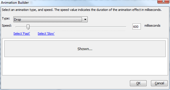
- Show animation speed
Specify the animation speed. You can select a pre-defined option (slow = 600 milliseconds, fast = 200 milliseconds), or you can enter an explicit value in milliseconds.
- Hide animation style
Select the animation method to use when the window is closed. Fade and Slide use methods in jQuery core. Other options require jQueryUI.
- Hide animation speed
Specify the animation speed. You can select a pre-defined option (slow = 600 milliseconds, fast = 200 milliseconds), or you can enter an explicit value in milliseconds.
Client-side Events Properties
- Before execute event
Specify the name of a Javascript function to call before the callback is made to open the target Grid. This Javascript function will take 'go' as an input parameter. 'go' contains all of the settings for the target Grid to be opened. The purpose of this function is to allow you to override any of the properties of the passed-in 'go' object.
- onInitialize
Specify the Javascript code to execute the first time the window is shown.
- onBeforeShow
Specify the Javascript code to execute before the window is shown.
- onShow
Specify the Javascript code to execute when the window is shown.
- onBeforeHide
Specify the Javascript code to execute before the window is hidden.
- onHide
Specify the Javascript code to execute when the window is hidden.
- onFocus
Specify the Javascript code to execute when the window gets focus.
- onMove
Specify the Javascript code to execute when the window is moved.
- onResize
Specify the Javascript code to execute when the window is resized.
Tab Pane Javascript Properties
- onBeforeChange
Fires before the tab pane changes. If event handler returns true, user can change tab. If event handler returns false, user cannot change tab.
- onChange
Fires when the tab pane is changed.
- onRightClick
Fires when user right-clicks on a tab pane.
- onInitial
Fires when the tab pane is created.
- onBeforeRemove
Fires before a tab pane is closed. If event handler returns true, user can close tab. If event handler returns false, user cannot close tab.
- onRemove
Fires when the tab pane is closed.
Ajax Failed/Offline Javascript Properties
- Timeout setting
(Optional) Specify the time to wait (in milliseconds) for a response from the callback. If a response is not received within the specified time, the Ajax failed message is displayed. The <Default> value is defined by the {dialog.object}.ajaxCallbackTimeout property (which you can change in your Javascript code). The default value for this property is 0 - which means no timeout - wait indefinitely for the server to respond.
- Ajax failed message
This message is displayed in the case of a failed Ajax callback (i.e. the server does not respond). You can specify a Javascript function to call if the Ajax callback fails using the following syntax: javascript:name_of_your_javascript_function
- Offline Javascript
(Optional) Specify the Javascript to execute if the device is offline. Since the device is offline, the Ajax callback is not made. Therefore the code in the 'Ajax failed Javascript' property will not get executed.
See Also: JQuery Support
Videos
Advanced Options for Popup Windows
This video demonstrates some of the options available for configuring popup windows.
See Also